fakoo.de/en
Alphabets of disabled people

Color code (not only) for colorblind


ColorAdd-Logo

The new color code for color-blind developed by the portuguese designer Miguel Neiva
own color code logo with blue and red triangle and yellow slash, framed in black

Red (triangle, pointed to the upper left), yellow (slash) and blue (triangle, pointed to the lower right)

The color code of Miguel Neiva is called ColorAdd® because it is based on the mix of colors. The basic colors red, yellow and blue are indicated by simple symbols.

When these colors are mixed, new colors are created. The symbols are combined to identify these colors.

the color mix results in orange, violet and green - the symbols of red, yellow and blue are combined
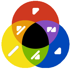
In combination with the symbols for white and black, which are indicated by frames or by inverse representation, further color gradations result:

  frame white inverse black
top red top frame light red top inverse dark red
slash yellow slash frame light yellow slash inverse dark yellow
bottom blue bottom frame light blue bottom inverse dark blue
top slash red + yellow = orange top slash frame light orange top slash inverse dark orange
slash bottom yellow + blue = green slash bottom frame light green slash bottom inverse dark green
top slash bottom red + [green] = brown top slash bottom frame light brown top slash bottom inverse dark brown
top bottom red + blue = violet top bottom frame light violet top bottom inverse dark violet
  dot frame (light) gray dot inverse dark gray
  dot frame bar silver slash inverse bar gold

the english original site of ColorAdd: www.coloradd.net

graphic print versions of ColorAdd Code

[text version of ColorAdd Code ]
The system of ColorAdd is easy to understand, well accepted by the population and therefore can greatly facilitate the life of colorblind people in many areas.

--->> Learn color code ColorAdd

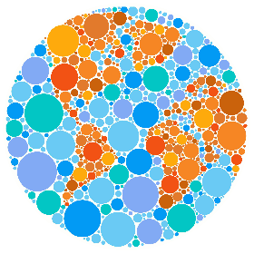
Some interesting facts about color blindness

  • 9% of the male and 1% of the female population are color-blind to a certain degree
  • 37% of the color-blind do not know what kind of color blindness they have
  • 59% recognize only a few colors
  • 22% do not see some colors
  • 64% of these people believe that color confusion is their biggest problem
  • 90% always need help buying clothing or food
  • 88% have difficulties or need help choosing clothes
  • 42% feel socially not fully integrated


ColorAdd Logo - ColorAdd color mixture (3 primary colors, three mixed colors and respective code)

Applications of ColorAdd ®

There are very different types of color blindness or color vision deficiency. For example, some people do not see reds and therefore can not distinguish yellow, red or green apples.

a red, a yellow and a green apple look pretty much the same with red-green-blindness

Color vision defects: normal - Protanopia - Deuteranopia - Tritanopia

Here would be a labeling of the apple variety (perhaps also on the shelf) with the appropriate color code help a lot.


Other people barely perceive colors, their world is gray. Since it can come in the choice of clothing ever very embarrassing situations.

an orange T-shirt and a dark blue shirt can not be assigned in gray-seeing

Brightness palette of achromats: Comparison of colors - shades of gray
If clothes are already provided with a corresponding color code during production, this is a great help for all color- blind people when  they are shopping and choosing their daily clothing.


Whether in subway networks or underground garages, in sports facilities or hospitals, the color coding is used everywhere for orientation or classification. This is a great challenge for color-blind people.

the metro in Porto (Portugal) uses colors with ColorAdd code for identify route

Stadium division by color in normal vision and Deuteranopia (red-green color blindness)

Guidelines system in a Portuguese hospital   Patient bracelets in a portuguese hospital

Here, the application of color coding can also facilitate people without defective vision the orientation for example in bad lighting.


Even color-blind people want to be creative or for professional reasons have to deal with colors on paper or on the computer. ColorAdd can help here!

Colored pencils with ColorAdd markings (12-pack) from Portugal

Even with websites you should consider the concerns of colorblind. When choosing the text color, depending on the color of the background, the contrast is just as important as the color difference. The following tool can help the web designer to decide:

Download of Color Contrast Analyzer


But even for the blind this color code is usable, if it has been designed as a tactile relief.

ColorAdd-Farbcode as relief

However, it must always be clear (as with the ground markings) where at the symbol is above and below. This can be characterized by an additional line below.


-->> the english original page of ColorAdd: www.coloradd.net


--> ColorAdd Code for printing printer :

ColorAdd in Braille explained


ColorAdd color symbols

further information about color blindness:

types of color blindness on Wikipedia
total color blindness on Wikipedia

round color test chart with world map motif