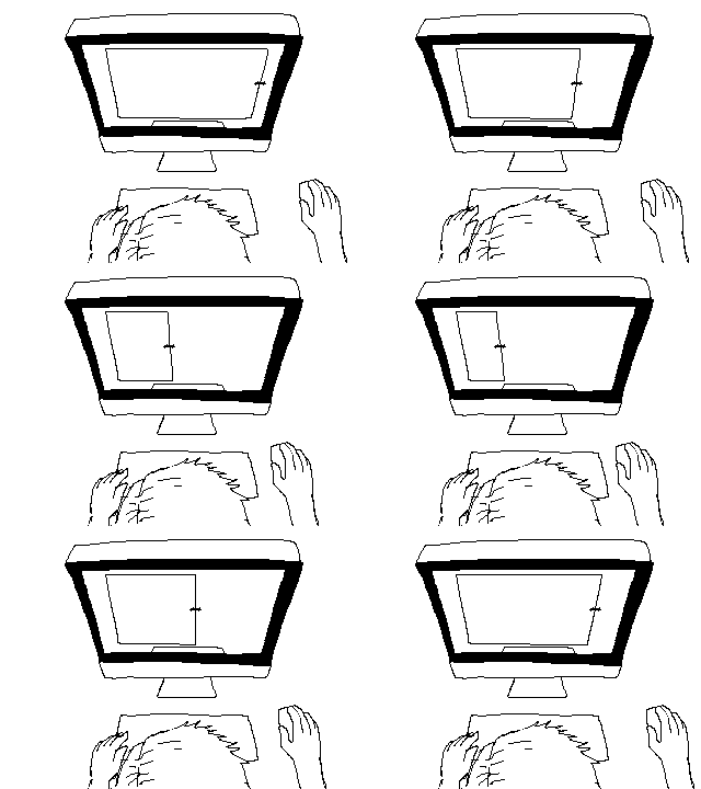
The screen width
The most important parameter for responsive web design is the screen width.
The term responsive web design
means that the

Individual elements of the page are
This ensures that the website can be
Determining the screen widths
There are basically two ways to react to the screen width. The
- there are several specifications for screen widths, depending on whether browser elements are included or not
- adjustments to the website can only be made after loading
- the reaction to changes is delayed
- if the user switches off Javascript or uses a browser without Javascript, the website remains in the original design
- there must always be a permanent query of the screen dimensions in the background in order to be able to react
The second and absolutely more elegant option is
- all representations dependent on the width are stored in the browser memory before they are displayed by the browser
- switching occurs without delay when the width of the browser window changes
- with cleanly programmed CSS, the website always appears optimally on the respective device and also adapts to screen changes (rotation of the smartphone or similar) abruptly
- Javascript is not required for the layout/design
Current screen widths
Here is a comparison of the different
Conclusion:
Any discrepancies that occur result,
